
Retail Circle
DesignSystem_StyleGuide
The single source of truth for the Retail Circle look. Every colour, size, and component below is driven by src/styles/tokens.css. This page is the contract — build from these tokens and components, and the whole site stays consistent. Change a token in that file and everything here (and everywhere it's used) updates at once.
Colours — Brand
--rc-purple#694ef7Primary CTA / accent--rc-purple-deep#5038d3Hover / pressed--rc-lilac#cdaafbEyebrow / link / on-dark accent--rc-lilac-mid#9777f4Mid lilac accentColours — Gradient internals
--_rc-purple-vivid#7a11ffVivid gradient stop--_rc-blue-purple#636affGradient tail--_rc-lilac-pale#e2b8faGradient startColours — Neutrals (semantic roles)
--rc-text#ffffffPrimary text on dark--rc-text-muted#c3c3d0Secondary text--rc-text-subtle#8f8fa5Placeholder / subtle--rc-border#484853Default hairline--rc-border-soft#333336Faint divider--rc-bg#1c1c1fPage background--rc-surface#333336Raised card / panel--rc-surface-raised#3d3d42Higher card / modalColours — System
--rc-danger#ff5a65Error / destructive--rc-success#35c66bSaved / valid--rc-warning#f5a623Caution / pending--rc-link#cdaafbInline body-copy link--rc-focus-ring#cdaafbKeyboard focus outlineContrast matrix
Computed live from the token hexes (WCAG 2.1). AA = safe for body text, AA large = only 18px+/bold, FAIL = don't use for text. Note --rc-purple is AA-large only — fine for headings and big CTAs, never for body copy.
| text / accent | --rc-bg | --rc-surface | --rc-surface-raised |
|---|---|---|---|
--rc-text | 17.0 | 12.6 | 10.8 |
--rc-text-muted | 9.7 | 7.2 | 6.2 |
--rc-text-subtle | 5.4 | 4.0 | 3.4 |
--rc-lilac (link) | 8.7 | 6.4 | 5.5 |
--rc-purple | 3.3 | 2.4 | 2.1 |
Gradients
--rc-gradient-primarySignature CTA / pill--rc-gradient-richHero words / large fills--rc-gradient-barUnderlines / dividers / active tab--rc-gradient-glassGlassmorphism card fill--rc-gradient-scrimFade-to-bg scrimEffects — mesh gradients, glow & grain
<MeshBackground> — grainy mesh gradient
<MeshBackground variant="purple" as="section">…hero content…</MeshBackground><Glow> — cinematic horizon (move your mouse over it)
Interactive by default: the anamorphic flare tracks the pointer along the seam, the arcs parallax, and it reveals on scroll-in. Rendering auto-pauses off-screen; parallax + tracking are disabled underprefers-reduced-motion. Pure CSS + a tiny vanilla script — no WebGL.
<Glow variant="horizon" as="section">…hero…</Glow>          <!-- interactive by default -->
<Glow variant="horizon" interactive={false} />               <!-- static -->
<Glow variant="horizon" image />                             <!-- pixel-exact PNG -->
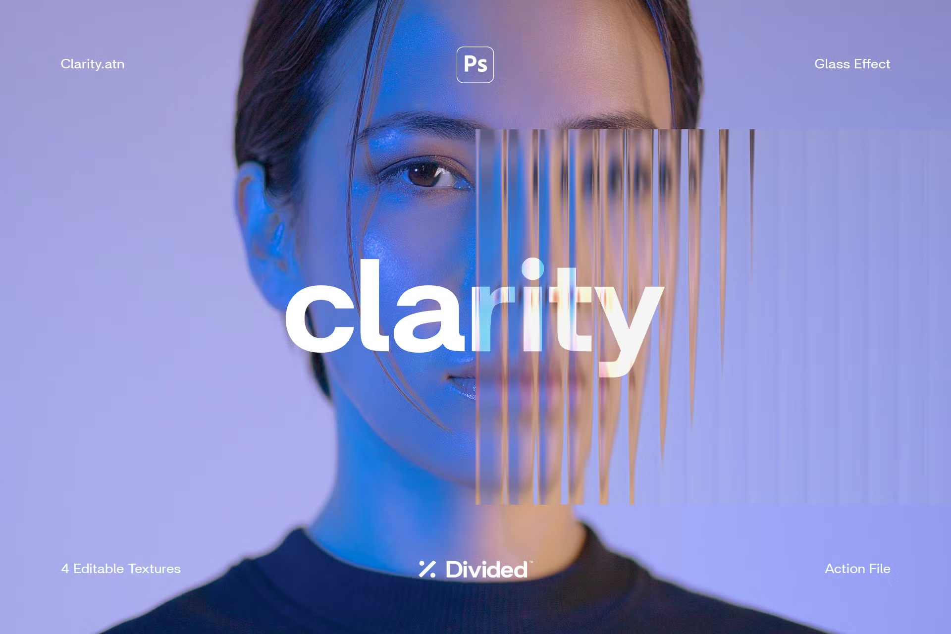
<ReededGlass> — fluted glass ridges
✦ Retail Circle
Glass
Effect
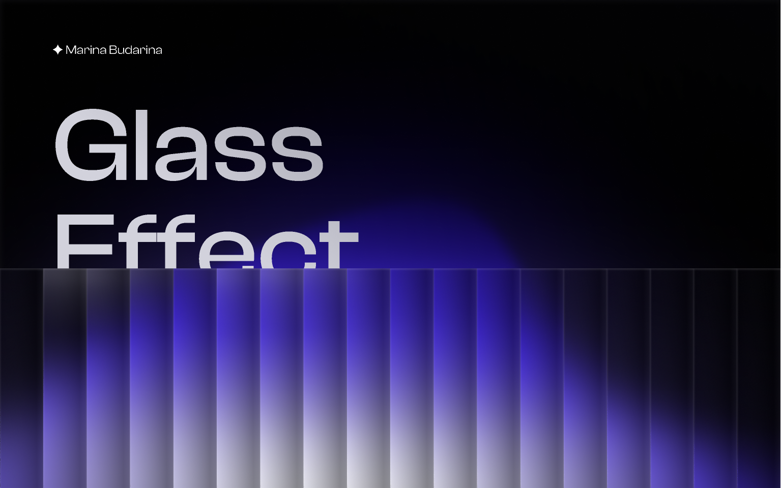
<ReededGlass>Above: a panel laid over a gradient — the flutes bend and blur what's behind them. Tune flute width with width, coverage withband.
<ReededGlass variant="glow" band="52%" as="section">…hero title…</ReededGlass>
<ReededGlass variant="panel" />        <!-- overlay that refracts content behind it -->
<ReededGlass variant="glow" width="14px" />
<GlassPhoto> — reeded-glass photo overlay

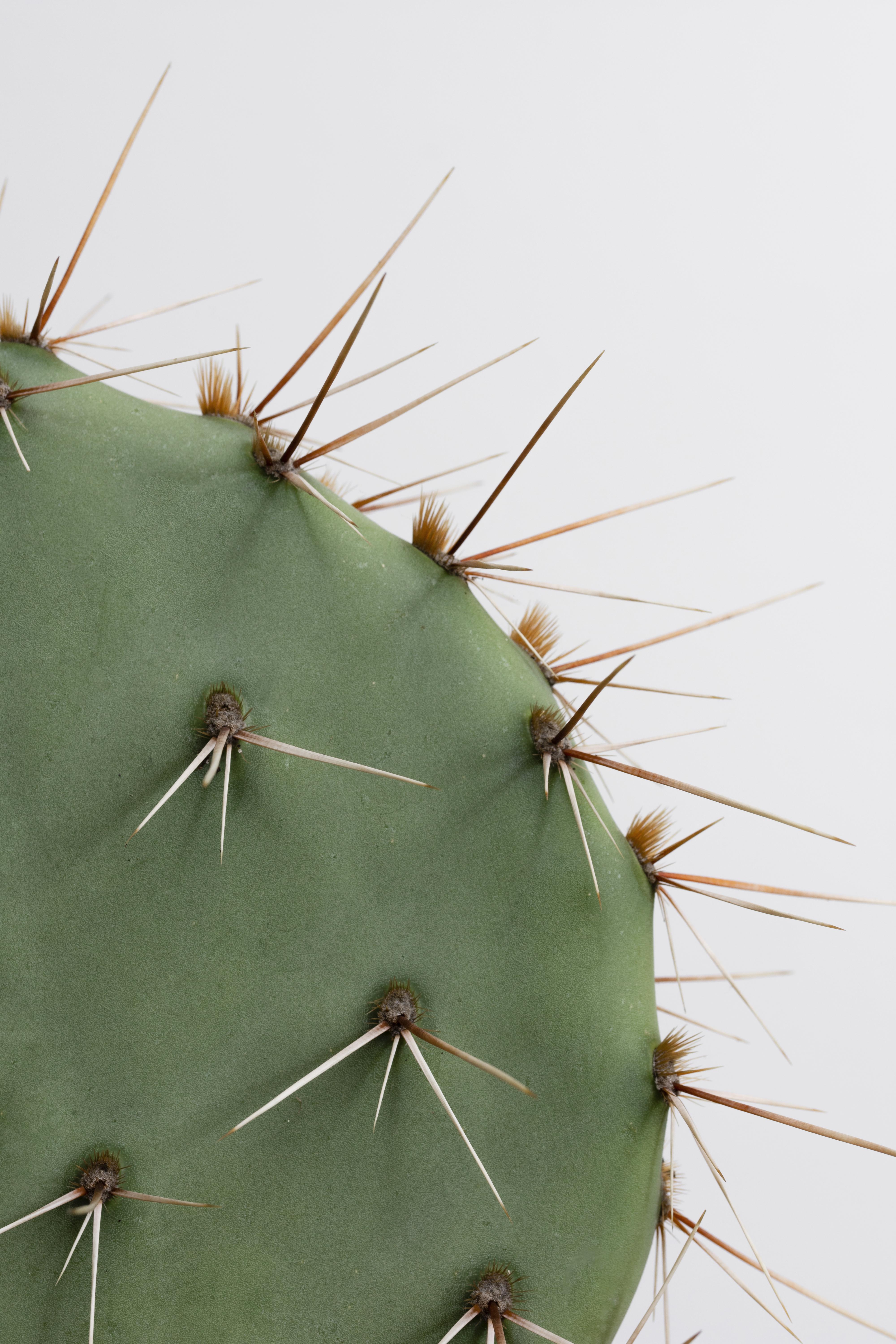
<GlassPhoto src="/hero.jpg" alt="…" cover="right" />
<GlassPhoto src="/hero.jpg" alt="…" cover="center" width={20} scale={30} />
<GlassPhoto src="/hero.jpg" alt="…" cover="full" />
Underlying tokens
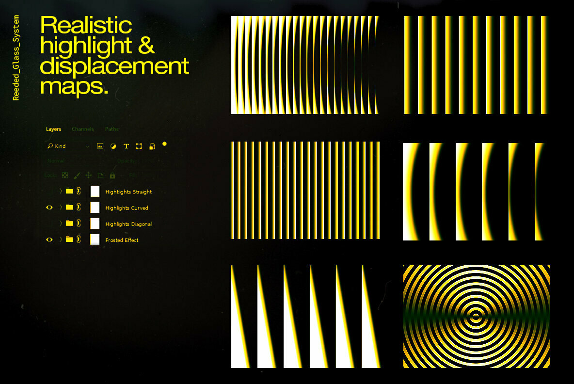
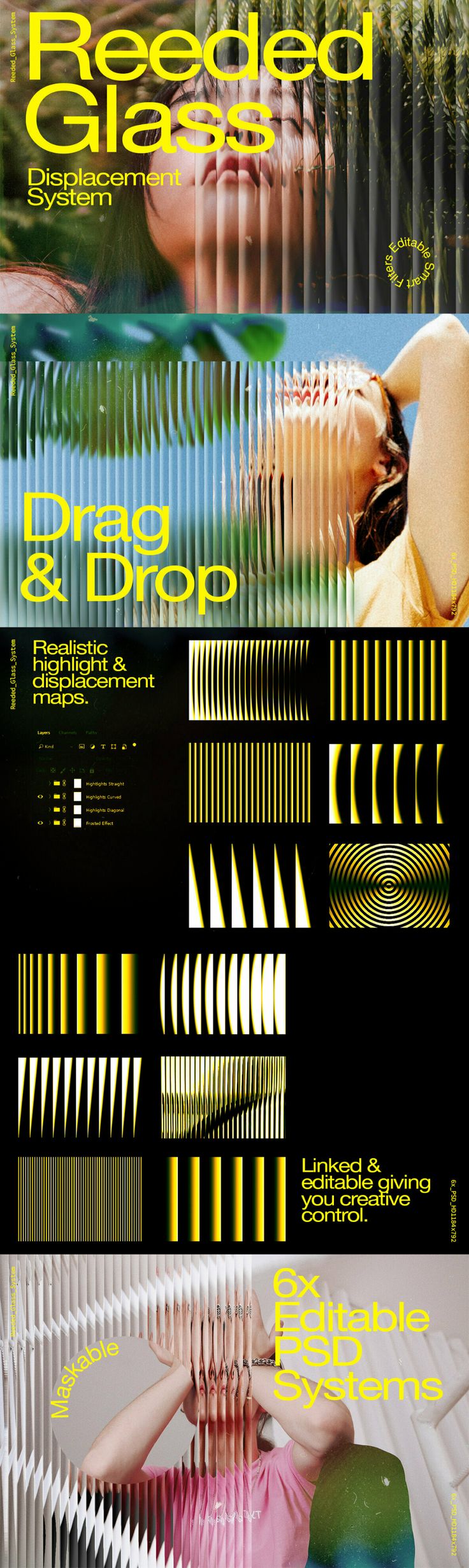
--rc-mesh-purple--rc-mesh-ember--rc-mesh-graphite--rc-glow-horizon--rc-glow-spot--rc-grainoverlay only (mix-blend: overlay)Reeded-glass reference board



Typography
--rc-text-displayDisplay · 64pxSell more, everywhere
--rc-text-h1H1 / page title · 48pxRetail, in a circle
--rc-text-h2H2 / section · 36pxOne platform
--rc-text-h3H3 · 28pxBuilt for merchants
--rc-text-h4H4 / card heading · 22pxSection heading
--rc-text-body-lgLead / large control · 18pxLead paragraph / large button
--rc-text-bodyBody (default) · 16pxBody text — the default paragraph size across the site.
--rc-text-captionCaption / legal · 13pxCaption / helper / legal text.
Spacing — tapered scale
--rc-space-14px--rc-space-28px--rc-space-312px--rc-space-416px--rc-space-524px--rc-space-632px--rc-space-748px--rc-space-864pxRadii
--rc-radius-sm8px--rc-radius-md12px--rc-radius-lg20px--rc-radius-fullpillBreakpoints
The canonical responsive stops. CSS variables can't be used inside@media — treat these as the single reference every component's media queries must match (mobile-first: min-width).
--rc-bp-sm640px · Phone → large phone--rc-bp-md900px · Tablet--rc-bp-lg1200px · Laptop / desktop--rc-bp-xl1440px · Wide desktopElevation
On the dark theme, depth comes from lighter surfaces, not drop shadows (dark shadows are invisible on a dark background). Stack surface tiers for cards and panels; reach for a shadow token only for the CTA glow or a truly floating layer.
--rc-bg#1c1c1fPage background (base)--rc-surface#333336Raised card / panel--rc-surface-raised#3d3d42Higher card / modal body--rc-surface-2#484853Highest surfaceShadows
The only two shadows that read on dark: the CTA glow and one overlay for floating layers.
--rc-shadow-purple--rc-shadow-overlayMotion
The signature interaction is a subtle press on hover, over one shared duration. Hover the tiles. Every interactive element should reuse these — don't invent new durations or easings.
--rc-pressscale(.97) — buttons, cards, tiles--rc-press-widescale(.99) — full-width / large blocks--rc-transition.3s — the one duration for all state changesButtons
Copy
<Button variant="primary" size="md" href="/signup">Get started</Button>Do
- Exactly one
primaryper view — it's the single main action. - Use
secondary/ghostfor everything else. - Set
hreffor navigation, omit it for form/JS actions.
Don't
- Stack two
primarybuttons side by side. - Author raw
w-button/<a class="button">markup. - Hard-code padding or colour — the variant already carries it.
Components
<Card> — surface container
Solid (default)
The workhorse content card — opaque --rc-surface with a hairline border.
Solid · raised
One step lighter (--rc-surface-raised) for the card that must pop.
Glass
Signature glassmorphism — use over imagery / a glow, not the flat page bg.
Link card →
Pass href — whole card becomes a link with the press + accent edge.
<Card variant="glass" raised>…</Card><Input> — text field
We'll never share it.
Enter a valid https:// URL.
<Input id="email" label="Work email" type="email" error="…" /><Link> & <Badge>
Inline links use the Link component andopen external tabs safely. Buttons are for actions — links are for navigation inside copy.
<Badge tone="success">Active</Badge> <Link href="/x">read more</Link>